Joshua Petker: Let's Talk About Paint
Story by Sage Vaughn // Portrait by Max Knight
As I navigate the way from Altadena through ever-present traffic to Anat Ebgi Gallery in East Hollywood, I notice how many new buildings have popped up in East Los Angeles. Much like Madonna’s face at the Emmys, the big changes don’t engender much of an opinion on my part, but it definitely doesn’t look familiar to me. The street the gallery is on is a perfect little microcosm of what I love about LA: On one side, signs advertise a shoe doctor, a mini market, and a smoke shop, and on the other, nestled within the shadow of the big blue Church of Scientology building, lies Anat Ebgi Gallery and a brand spanking new restaurant that is nearly impossible to get a reservation for. High and low. Intermingling in a copasetic, pre-gentrified, harmony. Expensive coffees, cheap tacos… and no parking.
I pitched the editor of this magazine the idea of covering the Joshua Petker opening, telling him “I want to talk about good paint.” He agreed rather quickly, and I rather quickly realized I have no idea what I’m doing. Good writing steals from reality its single greatest quality, its indescribability (that’s from Olga Tocarczuk), while good painting broadens the inexplicable experience of life by making it even more multi-dimensional (that’s just me). I like Joshua Petker. He’s a genuinely affable guy, and he’s a good painter. That’s what I want to talk with him about, Paint. Let’s discuss the ineffable and find a way to make it effing effable. One's ideas and opinions about art are a lot like one’s assessment of their sexual prowess; we all think we have it right until we have to do it with someone new.
Before we can get to discussing his latest show, entitled Tambourine, he awkwardly apologizes about a series of convivial text exchanges where he had me confused with Shawn Barber, the world-famous tattoo artist.
“I had your number in my phone as Shawn,” Petker says to me. I had asked him to do the interview over text, and when he agreed, he thought I was Shawn Barber, the world-famous tattoo artist. “I’m glad it’s you, though,” he says. “Me too,” I say, as we look for a place to sit. I ask about his influences, and what he looked at as a kid. Almost every image-based artist has a turning point image that flicked a switch in their heads as a child. “I didn’t grow up with art,” Petker tells me. “For me, the thing that really turned me on to art was old psychedelic posters, the 1960s psychedelic posters. The amazing combination of Art Nouveau and clashing colors. I dig that stuff.”
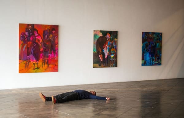
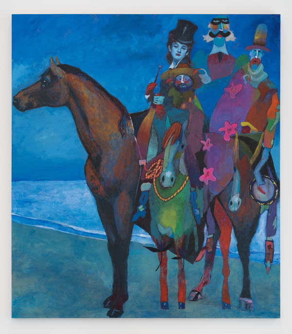
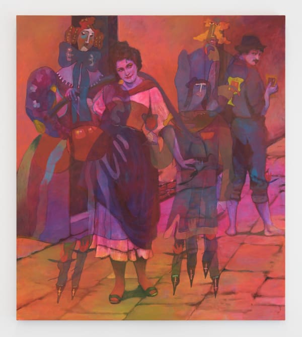
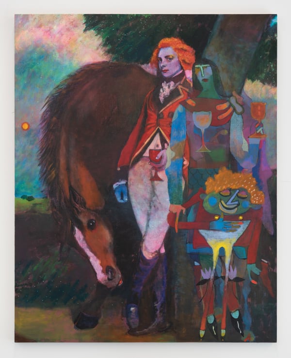
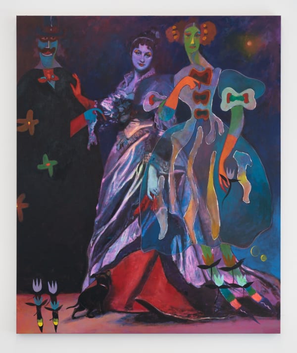
Looking at the work from his latest show, I can see the psychedelic undercurrents, both in the way he’s blown open his pallet and in his layered compositions. Beautifully rendered figures from 15th-century paintings are overlayed with illustrations from children's books. The subject matter of the imagery is almost beside the point. The strength of these works comes from the tension and vibrancy of how these images are reconstituted. Like a sample in hip-hop, the source is important, but not crucial to the final composition. It’s a good song if it’s a good song, not because the sample came from a deep David Axelrod cut or a James Brown breakbeat. When I mention sampling, Petker interjects, “Exactly! I feel like a DJ, mixing two elements that don’t go together while bringing them together.”
Subject matter aside, the compositions are astounding. The pieces create a visceral kaleidoscopic innervation. You almost don’t want to turn your back on some of them. They radiate. Some have a subtle exuberance that seeps toward the viewer from the deeply shadowed scenes of merriment, while others vibrate with a tropical fruit-flavored menace that demands a double take. There’s also an anxiety throughout that I find enjoyable. The stacked imagery and the composition create an optical distrust. “Yeah... distrust,” Petker says, “I like that word.”
While the new Avatar movie made me wish for a 3-hour case of colorblindness, hearing loss, and a general drop in IQ, Petker’s’ work makes me wish I could use CRISPR and graft mantis shrimp DNA into my ocular nerves. There are color combinations here that shouldn’t be in harmony, but he makes them look great. Like when you see a tall person dating a short person, and you think, yeah, I never thought of them together but it looks like a real good time. This is a body of work that begs to be seen and felt, in person. “That’s the fun for me,” he says. “I want something otherworldly… to show you more than you can see. Something about clashes. Sometimes Maria, my wife, will ask me, “Is this too much?” and I never know what to say because I like it too much!”
I pose synesthesia as a way to start discussing the choices he makes in regard to color, but he expresses doubt in having it, though “My daughter thinks she got it.” Then immediately the talk veers into music again.
“Music was a bigger influence than art,” he says. These paintings are harmonies, complex fugues of layers and colors, each supporting the whole even when they clash and create tension within the picture plane. There are riffs on motifs throughout these works. It’s like jazz, but not, landing somewhere closer to a live jazz performance where each player gets a turn to riff on the theme, but in this show the colors are the musicians. His color work is central to these new pieces, managing, for example, to render light as a semi-gaseous citron cloud in the largest piece, Cellar Song. It’s a large horizontal piece depicting various musicians, dancers, and revelers in a dark space crowded with all sorts of extraneous other characters. The palette ranges from a reddish blue duet with turquoise to a couple of fierce cadmium yellow streaks across a scarlet set of minstrel pants. Mustard yellows lie as anchoring bass notes syncopated across the diptych (even as I type this, I realize it doesn’t make any sense). In the piece Red Coats, the sky is turquoise, pale corpse green, and a watermelon rose all at once with a burning orange sun setting in the distance. But especially in this piece, you can see he understands the secret that made Gauguin’s so inexplicably strong—the grays. Half of the painting is subtly muddied and dun. There are fifty shades of alley cat carefully played out across this work, all of which make the colors shine even more without veering into the gaudy or glaring.
I wonder if there are any color combinations that are overly comfortable, mixes, or companions that he finds himself leaning toward in his studio. “I’m still in the blue and red, to be honest,” he says. “I just love that color combination. You have that blue on that red, and they move. Even when they’re not moving. There was a time I couldn’t use green, but now I can.” When I ask what changed, he shrugs, “Probably just learning to paint.”
We start talking about his studio practice. Every artist has a way they get themselves to create something novel, some combination of rituals, and even gambles, that provide a fertile atmosphere in which to succeed or fail. Amy Sillman describes a painting studio as a kind of “haphazard chemistry lab where non-scientists work like medieval alchemists.” Petker prefers to work alone. “I enjoy nearly every part of the job and feel I'm too flighty to manage having others help in the studio… I'm in the studio four to five days a week working normal business hours. I most often listen to audiobooks or podcasts. I love music but find it too distracting when I'm working. At least, no music with lyrics.” Which makes sense, since he’s composing rhythms and melodies, not writing poetry.
“In the studio things are fairly under control. It's a calm and meditative process to work on a painting and I'm pretty tuned in to what I'm doing. However, the inspiration behind work certainly comes from chaos. I read a lot and am interested in ideas. I always have a multitude of thoughts going on at one time and painting is a moment of silent pause amongst that chaos.”
When I ask him about what he’s been looking at lately, he says, “Just being honest, I don’t look at much besides my friends. It’s a weird balance because if you close yourself off you run that risk of being too insulated… I also don’t like seeing too many things and getting affected… I feel like I have a very clear idea of what I want to do.” When I push a little, and ask what his biggest influence is, he admits, “How do you put this into words… psychedelics.” I try to backpedal this and offer that psychedelics could be a conceptual placeholder to help us to describe the ineffable source of inspiration, or the intuitive feelings that guide choices in the studio, but he clarifies, “I’m literally saying that taking psychedelics was what I think led to a lot of this stuff. It’s one of the most important things I’ve ever done in my life… I think it opened up my eyes, though I haven’t done it in twenty years.”
I feel compelled to chime in and give a truncated psychedelic resume of my own. But leave out the acid-drenched story of falling through a door at the Warfield in San Francisco during a Jerry Garcia show, landing in the venue’s stockpile of Christmas decorations, and losing my shit when I thought all the Deadheads had turned into reindeer. Although psychedelics is the only branch of drugs that have their own font, he doesn’t lean too heavily on the predictable aesthetic of hallucinogens.
In Dave Hickey’s collection of essays, Air Guitar, he goes through the set list of psychoactive chemicals and their cultural byproducts. “Heroin culture has produced some great jazz and some even greater writing. Amphetamine culture has cranked out zillions of good country songs, lots of Hot rods, tons of high fashion, and some very shiny art… and thanks and no thanks to cocaine, we have Rambo flicks, disco, and Freudian analysis.” But when it comes to psychedelics, he explains that they change the way we see what we see. Therefore, they can be signifiers of an experience that is more than what merely appears. “Within the deeper history of image-making, psychedelia is a manifestation of anti-academic strategies.”
I ask what other artists he surmises have had their aesthetic affected by psychedelics, and Petker ponders, “I'm not sure I know the answer to this. For me, seeing psychedelic rock posters was the first time I felt totally affected by created images. I think of the famous poster artists of that time: Stanley Mouse, Alton Kelly, and Wes Wilson, for example. The clashing colors and Art Nouveau aesthetic really hit me. But as music has always been a larger influence on my life than art, I'm sure the connection weighs heavy on me. In regard to serious painting, I think of works by James Ensor, František Kupka, Paul Klee, Marc Chagall, Francis Picabia ... it's a large subjective list of people.”
To paint these days is to make a conceptual choice. I should say, to paint well these days is to make a conceptual choice. Petker’s works affirm the vitality of choice of pushing around pigment on a surface. The sense of play and color within these pieces is that of a well-rehearsed group of incredible musicians … jamming. It has that feeling of a session. There is freedom throughout the pieces that allow “mistakes'' to look at home without forcing the eye to correct them. The artist’s hand is evident at the party, but not the voice taking over the party in a podcast-like monologue nor a giant BURP. So much work on canvas recently has been weighing down the ends of the spectrum of technique, overly fetishized technicians versus the regurgitated rebirths of zombie formalism.
Petker goes on to observe that he wants “to make paintings people like… attractiveness is a big part of it. This, I believe, is the core reason why the ‘paint is dead’ or ‘painting as sign making’ revolution lost the war. Paintings are great to look at. Collectors are going to look at it one way, academics are going to look at it another way… and for me, the goal has always been to make something that pleases both camps. That’s what I’m hoping for. Because they’re attractive, but I think you can dive into them on a more intellectual level.”
The millions of choices a painter makes are evident and compelling to the eye. We have evolved to navigate this world mostly by sight. Paintings can foster a softly vigilant frame of mind that is akin to watching a flame. In an optically saturated world, where so much is aggressively vying for saliency and attention, good paint can be a nourishing cerebral oasis.
“I struggle to come up with a definition of sublime,” Petker muses, “and someone challenged my definition recently, but what I’ve always thought of as sublime is something so beautiful it could kill you. Like looking at the ocean. You feel relaxed, but it’s so scary. Sharks and drowning, and vastness… but you could stare at it for hours. If my work hints at that unsettling, that’s good.”
Petker’s solo show. Tambourine, was on view at Anat Ebgi Gallery in Los Angeles this past winter.
July 14, 2023
